Sirena Splash
☺︎
Sirena Splash ☺︎
Sirena Splash Sparkling Water
Problem:
The challenge entails developing a new beverage brand tailored to meet the preferences of health-conscious Gen Z consumers aged 18-24, who prioritize natural ingredients, seek increased energy levels, and value bold flavor experiences. The task involves creating a brand identity and packaging design that effectively communicates the product's natural, energizing qualities while resonating with the target audience's lifestyle and aesthetic preferences.
Solution:
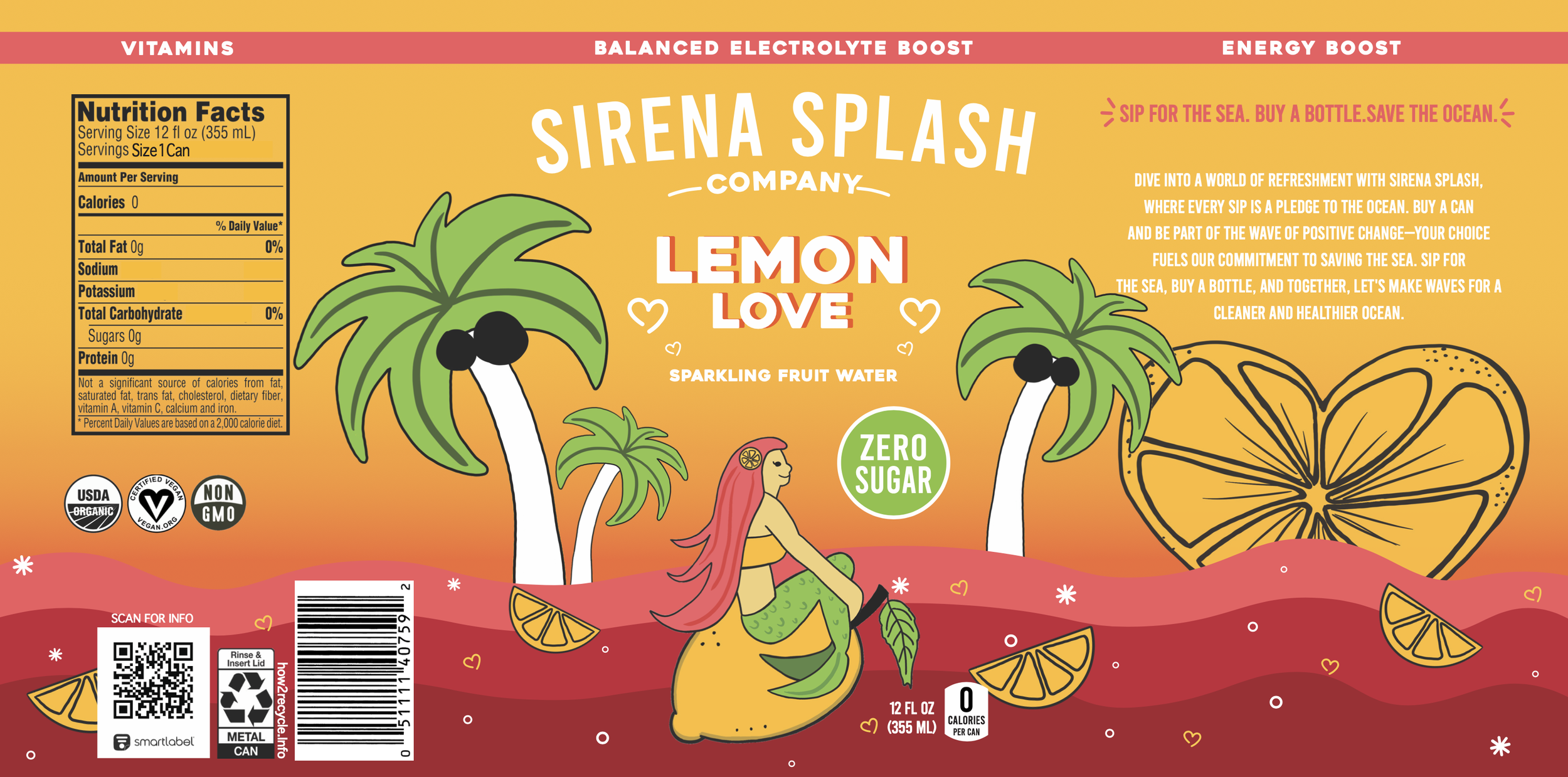
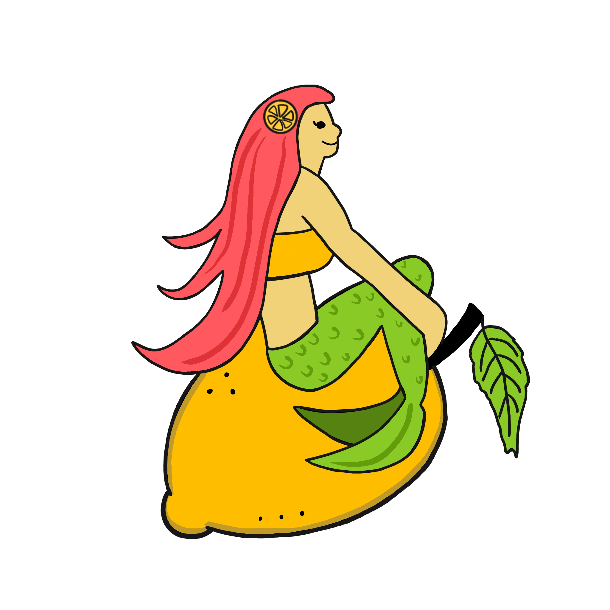
The solution entails the development of 'Sirena Splash,' a dynamic beverage brand that combines the invigorating qualities of sparkling water with essential vitamins, energy boost, and balanced electrolytes, all without added sugar. Central to the brand identity is the enchanting mermaid character, depicted atop different fruits to reflect each flavor variant—Lemon Love, Lime Delight, and Strawberry Sunshine. The can packaging design features a captivating sunset backdrop, complemented by playful waves and palm trees, evoking a sense of summer escapism and vitality. Utilizing vibrant colors and bold typography, the design aims to convey a feeling of joy and refreshment while highlighting the product's natural ingredients and functional benefits.
Beginning Process
Figuring out the potential brand names, potential slogans, logo ideas, goals, claims, and callouts was all dumped onto this page. I went on Pinterest and pulled out some inspirational current beverages to draw out more ideas. I also wanted to stick to a bright and summery color palette for the series of my beverages.

Flats of All Three Flavors
Below are the flats of my three designs for each of the flavors I ended up choosing. The first flavor is ‘Lemon Love’. The second flavor is ‘Lime Delight’, and the third flavor is named ‘Strawberry Sunshine’. Overall, I kept the same look and setting, just switching out the background colors and the mermaid mascot and adjusting the fruit she’s sitting on to correspond with the flavors.